Utopia
Inspired by clarity and built for ease, transforming a cluttered landing page into a crisp, conversion-ready experience that builds trust at a glance.
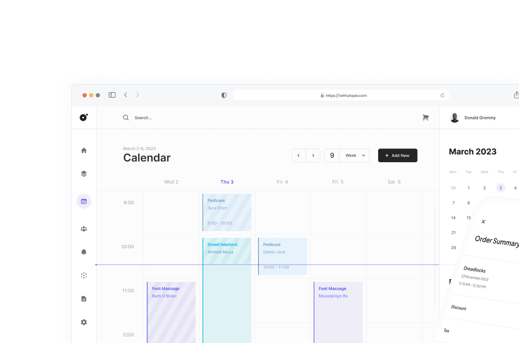
When the founder of Utopia reached out to me, he didn’t open with a detailed brief or wireframes. He simply said:
“There’s this project I’m working on with a friend. We plan to redesign the landing page. I don’t like what it looks like currently, so I decided to fix it.”
He wasn’t alone in his frustration. The original page was cluttered, hard to follow, and didn’t reflect the product’s promise. Utopia, a tool designed to simplify booking and payments for African entrepreneurs, needed a landing page that did the same — simplify, focus, and convert.
Building Clarity from Chaos
Designing trust, not just visuals.
My goal wasn’t to make things look prettier — it was to reduce cognitive load and create a clear, focused first impression that made users feel confident. This meant removing noise, tightening messaging, and guiding users through Utopia’s value in a simple flow.
Whitespace wasn’t a stylistic choice — it was strategic. I used it to separate sections, highlight benefits, and reduce overwhelm. The new layout introduced clear visual breaks, tighter hierarchy, and smoother transitions across devices.
On mobile, this made all the difference. Buttons stayed tappable, fonts scaled cleanly, and users could scroll with ease.
A Simpler Page, a Stronger Product
The new design didn’t just modernize the look — it built credibility. It showed users what Utopia could do without making them work for it. And it gave the product team a foundation they could scale with confidence.